
Manual Audit Grid: Reframing a Complex Expert Workflow
Transforming Accessible Web RAMP’s manual audit workflow into a flexible system for performing and tracking manual accessibility tests.
Role
Sole Designer — User Research, Interaction Design, Product Thinking, UI Design, Rapid Prototyping
Team
3 Software Engineers, 1 Accessibility Specialist
Timeline
2 Months, Launched October 2024
Overview
RAMP’s manual testing experience centered on completing full audits, a workflow that worked for expert auditors but saw little adoption among customers. I led the design of a grid-based experience that made audit coverage visible and gave users the flexibility to test and track progress on their own terms.
In the quarter following launch, average daily active users increased 44%, and average MRR grew 26% compared with the previous quarter.
Context
RAMP is a web accessibility SaaS platform that helps teams identify accessibility issues, organize remediation efforts, and track their accessibility work over time.
-
A manual audit is a human-led evaluation of representative website pages against the Web Content Accessibility Guidelines (WCAG). While automated scanning can catch ~40% of violations, manual testing can catch 100%.
-
The Guided Audit Tool is part of RAMP’s Chrome extension. It walks users through manual accessibility tests directly on the website they’re evaluating.
Solution: Turning a rigid audit process into a flexible, visual workspace
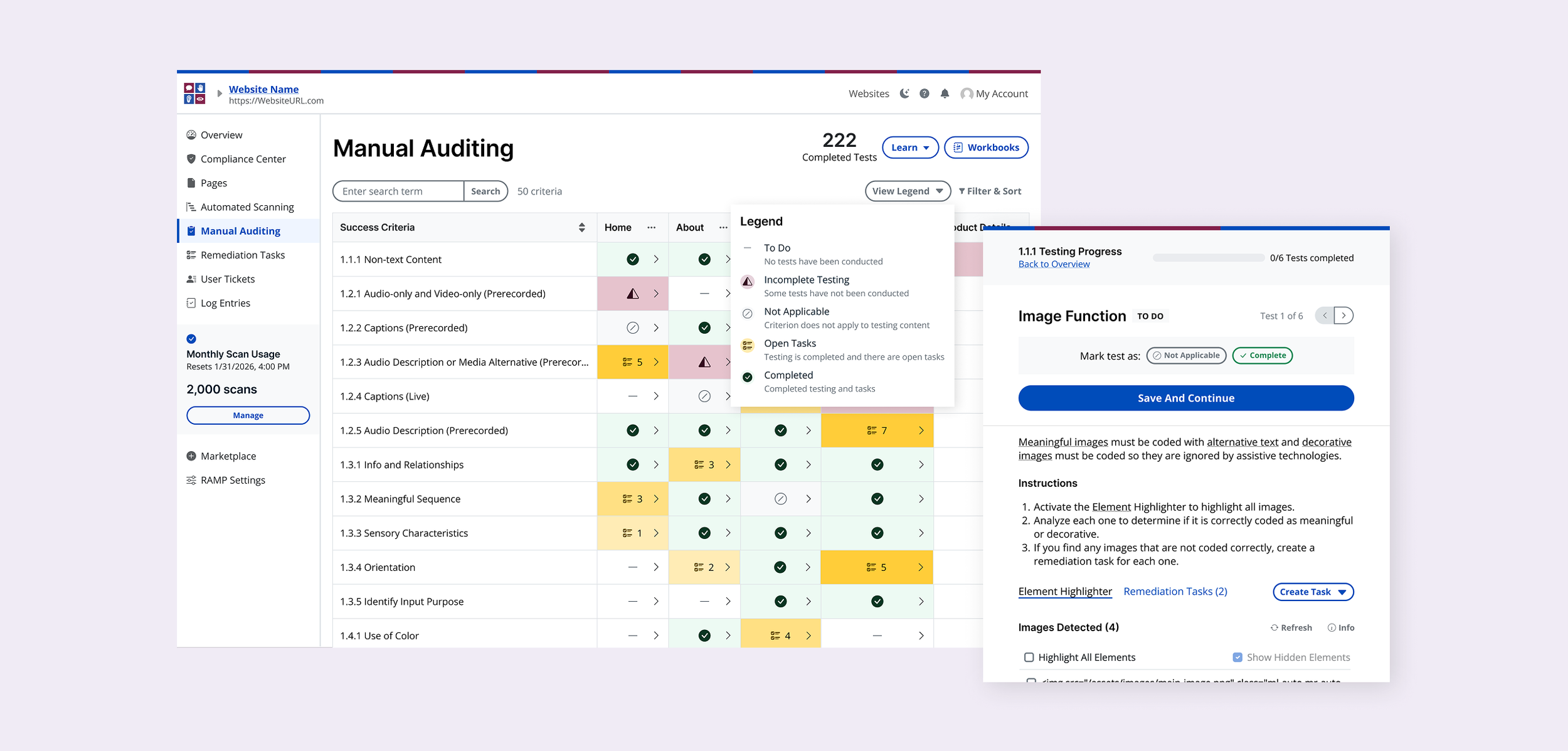
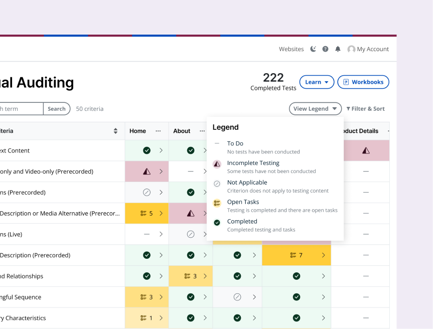
Manual audits evaluate representative pages against Web Content Accessibility Guidelines (WCAG) criteria. The grid makes that structure interactive, with criteria as rows and page templates as columns.
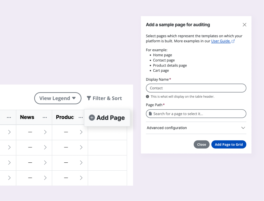
Define the scope of the audit
Users define their scope with representative pages, a standard approach for evaluating accessibility.
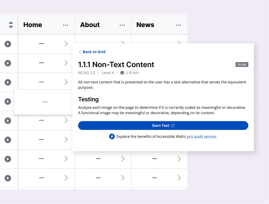
See the work before starting
Opening a cell shows the testing requirements and estimated effort before the user commits.
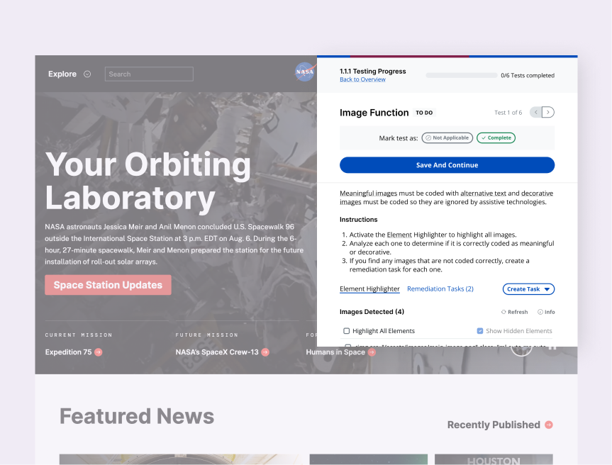
Launch tests in context
Launching a test from the grid opens the chosen page along with the extension, where users can complete the audit.
See findings flow back into the grid
Remediation tasks created during testing are saved back to RAMP, and the grid updates each cell’s status to reflect progress and open work.
Problem: Automated success was becoming a stopping point
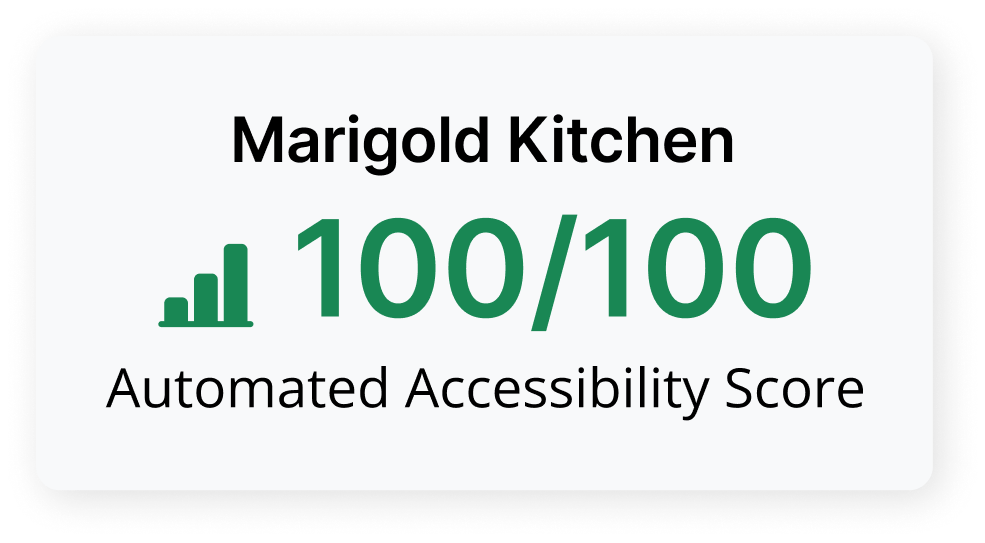
Once customers resolved automated issues and reached a high accessibility score, many treated the work as finished. But automated scanning could only take them so far; manual testing was still necessary to evaluate issues that required human judgment. Despite having a guided manual audit workflow in place, adoption remained low outside of our internal accessibility team.
Challenge
Take a complex manual auditing process built around expert workflows and make it approachable enough for customers to keep engaging with RAMP beyond automated issue detection, without compromising the workflow our internal accessibility specialists relied on.
Process
Mapping the existing workflow
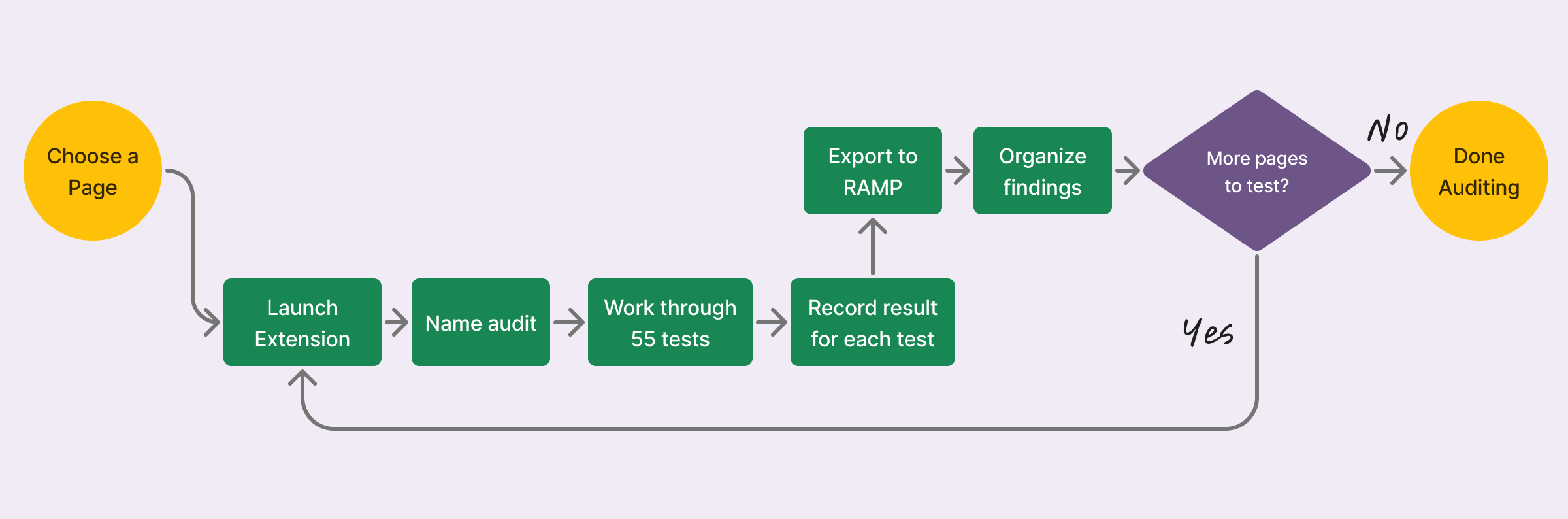
The existing experience was built around completing a full audit from start to finish.
The workload compounded quickly.
A typical audit required working through roughly 55 tests, and the process was repeated for every page in the audit.
Testing was only part of the work.
Completing the checklist produced findings, but users still had to export and organize them.
Little visibility into overall progress.
There was no quick way to see which pages were audited at a glance, unlike with automated scanning.
Talking to customers
To understand why adoption was low, I interviewed existing users and ran usability tests with first-time users.
A full audit felt like too much to take on at once.
Users appreciated the step-by-step guidance, but working through dozens of tests across multiple pages felt tedious and difficult to fit into their day-to-day.
We were asking customers to work like expert auditors.
The experience reflected the structured process our internal accessibility specialists used to complete professional audits. Customers wanted more flexibility.
Manual testing felt like a separate process.
Unlike other work in RAMP, manual auditing required users to leave the product, complete a full audit, then export and organize their findings before they could act on them.
Understanding the existing landscape
I reviewed other manual accessibility auditing tools to understand how they structured and surfaced audit work. Some focused primarily on guided, sequential testing, while more comprehensive tools added audit-level dashboards, tables, and reporting.
The strongest examples provided visibility into progress, but they were still dense and highly structured. This reinforced an opportunity to make the scope of an audit easier to understand and navigate without adding another complex dashboard.
Working backward from the audit’s end result
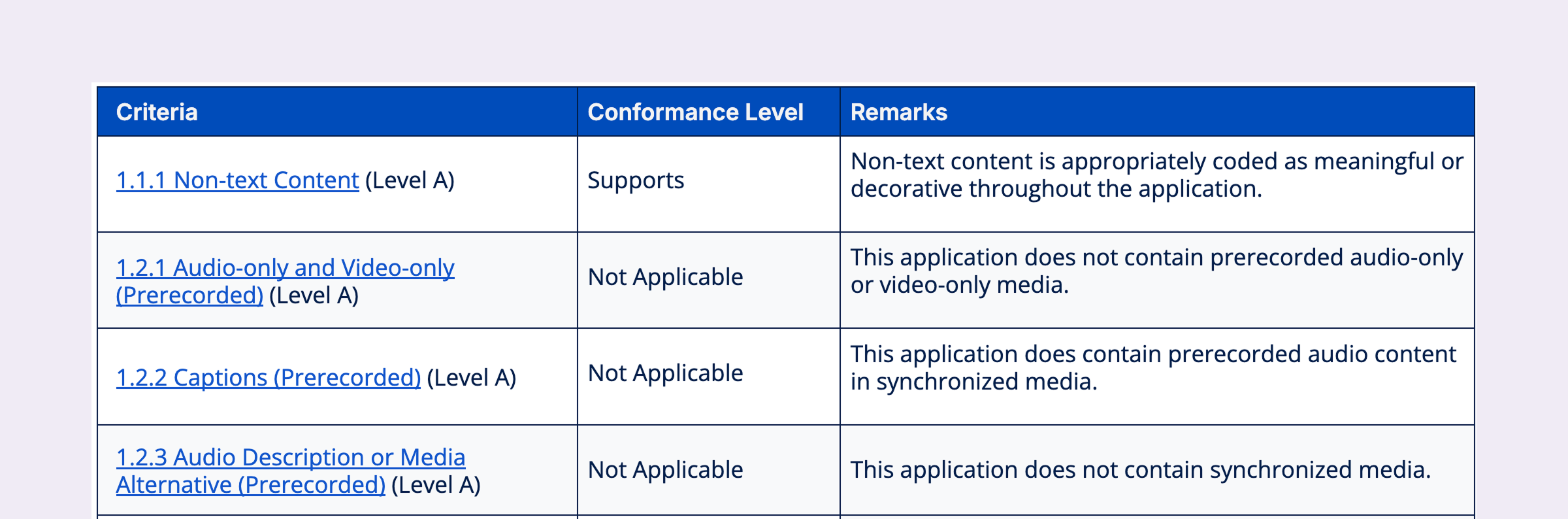
A professional audit will ultimately feed into an Accessibility Conformance Report (ACR), which documents overall conformance per criterion.
Dozens of individual tests across representative pages ultimately needed to become a clear outcome for each criterion. That made criteria × pages a more useful way to think about the audit than one long sequence of tests.
Principles
Autonomy
Let users choose what to test, when to test it, and how much work to take on at once.
Orientation
Make the full audit visible so users always know what they’ve covered, what remains, and where they are in the work.
Integration
Bring manual testing into the broader RAMP workflow, with clearer entry points and a direct path to remediation.
Constraints
Rigorous by design
Manual testing depends on human judgment. The work couldn’t be automated or condensed for this project without compromising the quality of the audit.
Two audiences, one system
The design needed to work for customers with less expertise while preserving the professional audit workflow our internal accessibility specialists relied on.
Two products, one workflow
Testing had to remain in the Chrome extension, where users could evaluate the live website, while audit management and remediation stayed in RAMP.
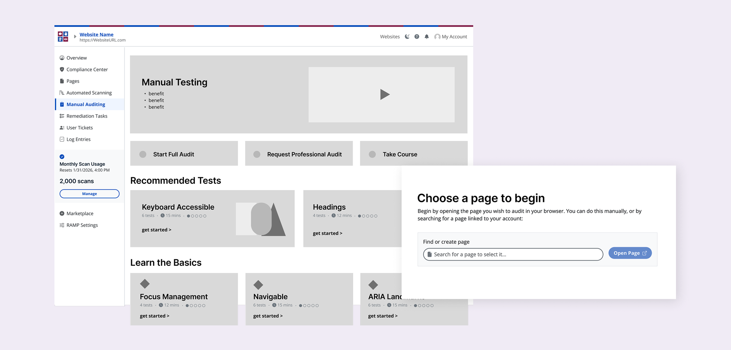
First direction: make the audit easier to start
I explored breaking the work into smaller groups of tests organized by difficulty. The concept borrowed from Recommended Tasks, an existing RAMP feature that was already successful at giving users a clear next action instead of asking them to interpret a large body of accessibility data on their own.
Users could start with beginner-friendly or recommended tests, see the time and effort involved upfront, and launch a smaller piece of work on a page of their choice. The full audit path remained available for professional auditors and power users, while customers gained smaller entry points into the same underlying testing process.
Pivot: Flipping the audit on its side
Recommended Tests made manual testing easier to start. Users could choose a smaller piece of work, but they still couldn’t see the audit as a whole, understand what had been covered, or easily track what remained.
The Accessibility Conformance Report analysis clarified what all of that testing ultimately needed to roll up to: a clear outcome for each WCAG criterion.
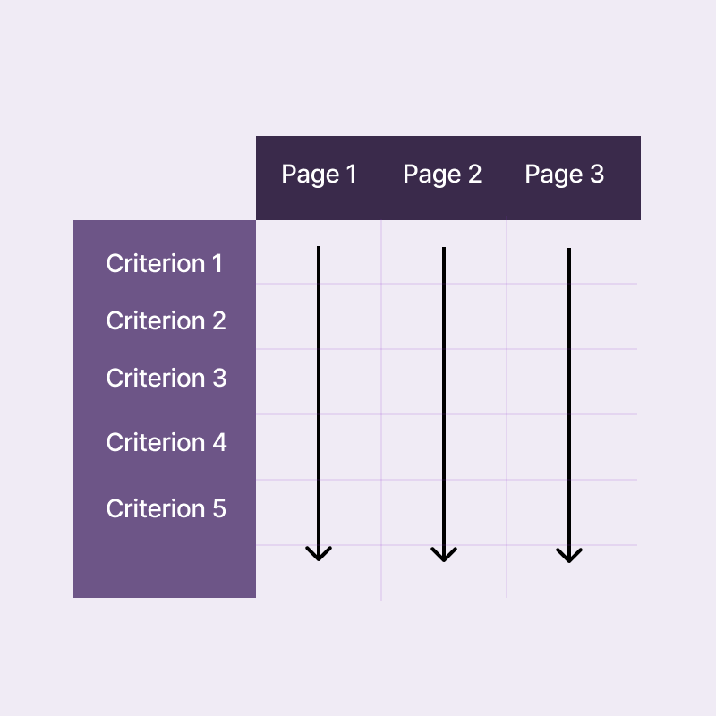
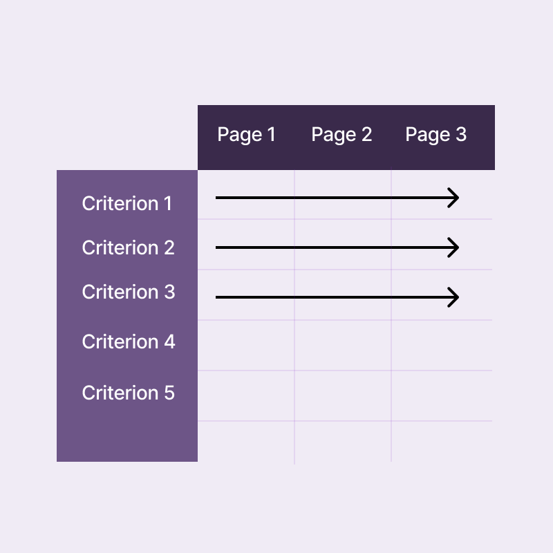
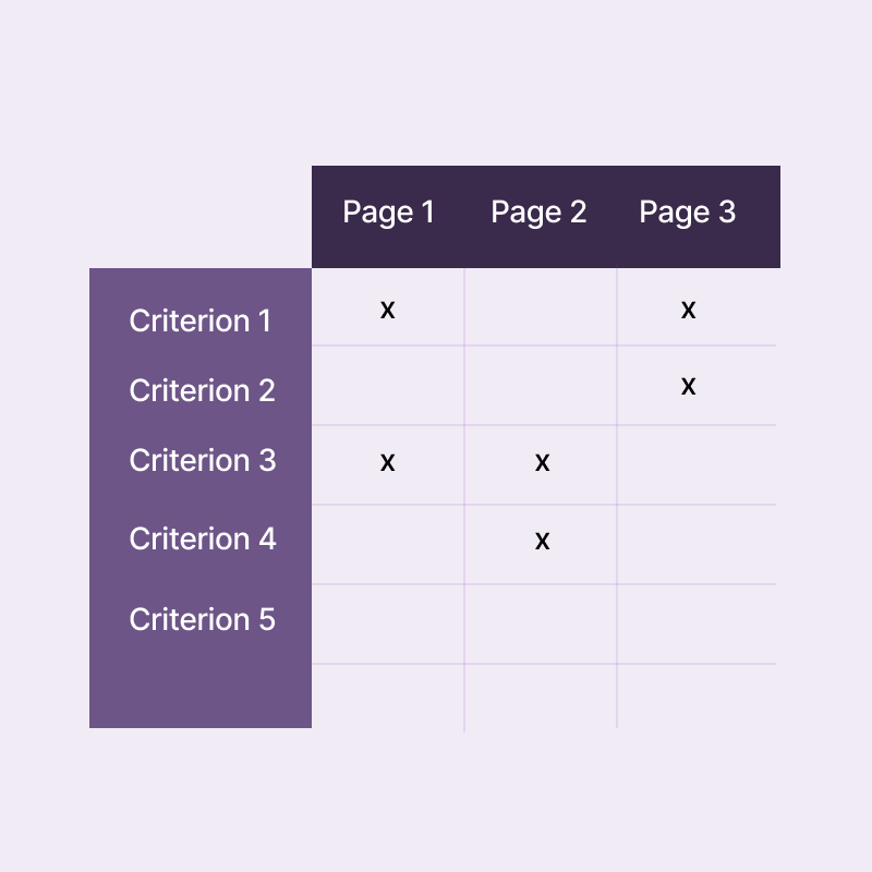
Bringing those two dimensions together gave us a different way to structure the experience: criteria as rows, representative pages as columns. Instead of moving through one long sequence of tests, users could see and navigate the full scope of the audit in one place.
Flexibility without losing momentum
The old workflow expected users to complete every test on one page before moving to the next. The grid removed that prescribed path.
Users could work through every criterion on one page, run the same criterion across multiple pages, or cherry-pick individual cells based on their time, role, or area of expertise. Having a flexible process meant keeping the audit momentum going regardless of their working style.
Opening a cell first showed the testing requirements, estimated time, and a short demo video, so users could decide whether a test made sense for them before committing to it.
From manual statuses to a living heatmap
I considered having users set each cell's status themselves after testing. I used VPAT-style outcomes like Supports, Partially Supports, Does Not Support, and Not Applicable so the mental model between the audit grid and the ACR it could eventually support felt consistent.
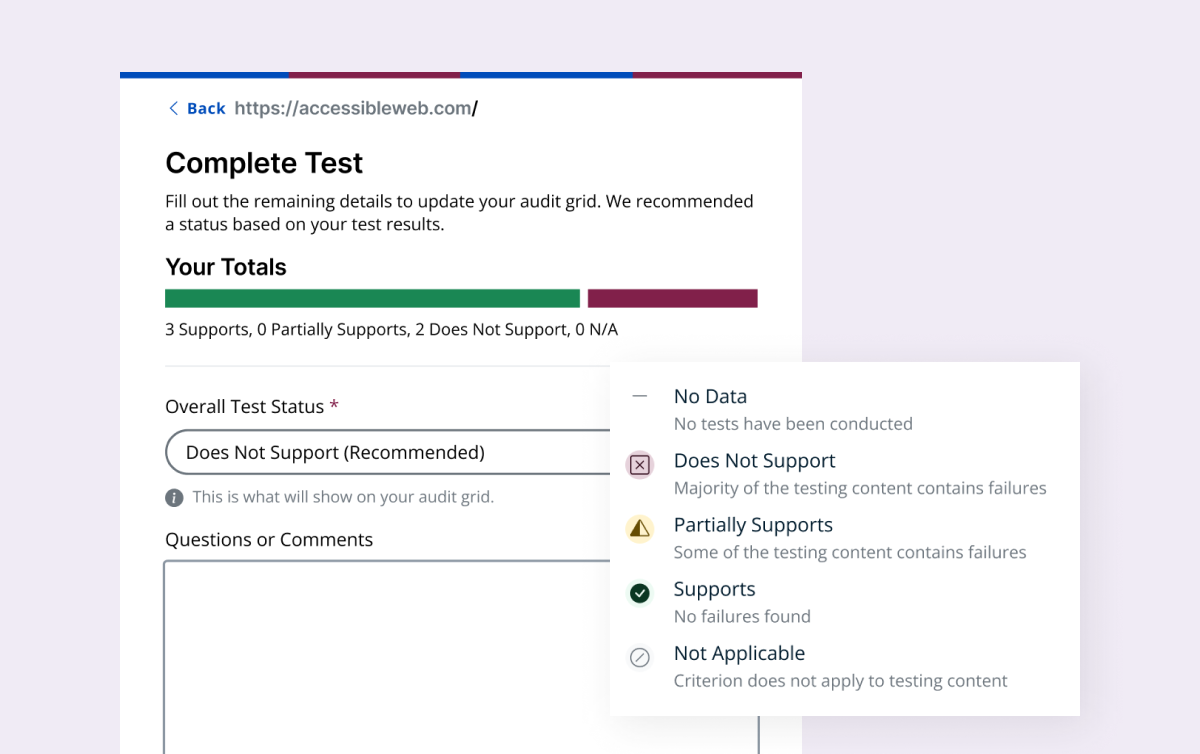
In practice, that created a few problems. VPAT statuses summarize conformance at the criterion level, while each grid cell represented one criterion on one page. Asking users to assign those outcomes cell by cell meant interpreting and summarizing results too early, before testing across the full criterion was complete. It also added manual upkeep.
So I shifted the grid away from reporting conformance and toward showing the state of the work. The final statuses were:
To Do — no tests conducted
Incomplete Testing — some tests still need to be conducted
Not Applicable — the criterion doesn’t apply to the content being tested
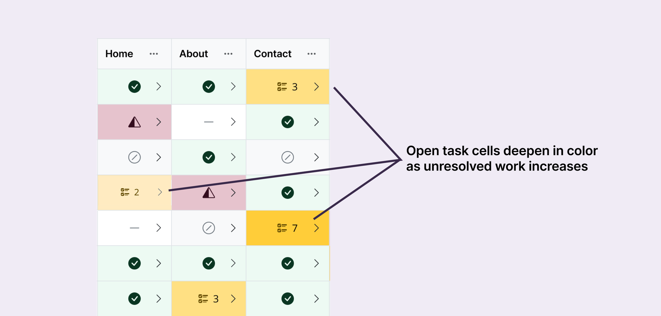
Open Tasks — testing is complete, but remediation work remains
Completed — testing and related remediation are complete
Heatmap in practice
Those states powered the heatmap. Color and icons made it possible to scan the audit for untouched, incomplete, and completed areas, while Open Tasks used progressively deeper shades of yellow as the number of unresolved tasks increased. That made it easy to see not only where work remained, but where the most follow-up was concentrated.
Because the grid introduced a new way of thinking about manual audits, we added an optional guided tour for users who wanted more orientation. Previous step-by-step experiences in RAMP had converted poorly, so we deliberately avoided making it mandatory. Users could get help understanding the grid or skip straight into the work. The tour was well received by customers, while keeping the experience aligned with our principle of autonomy.
Each cell kept the history behind its status
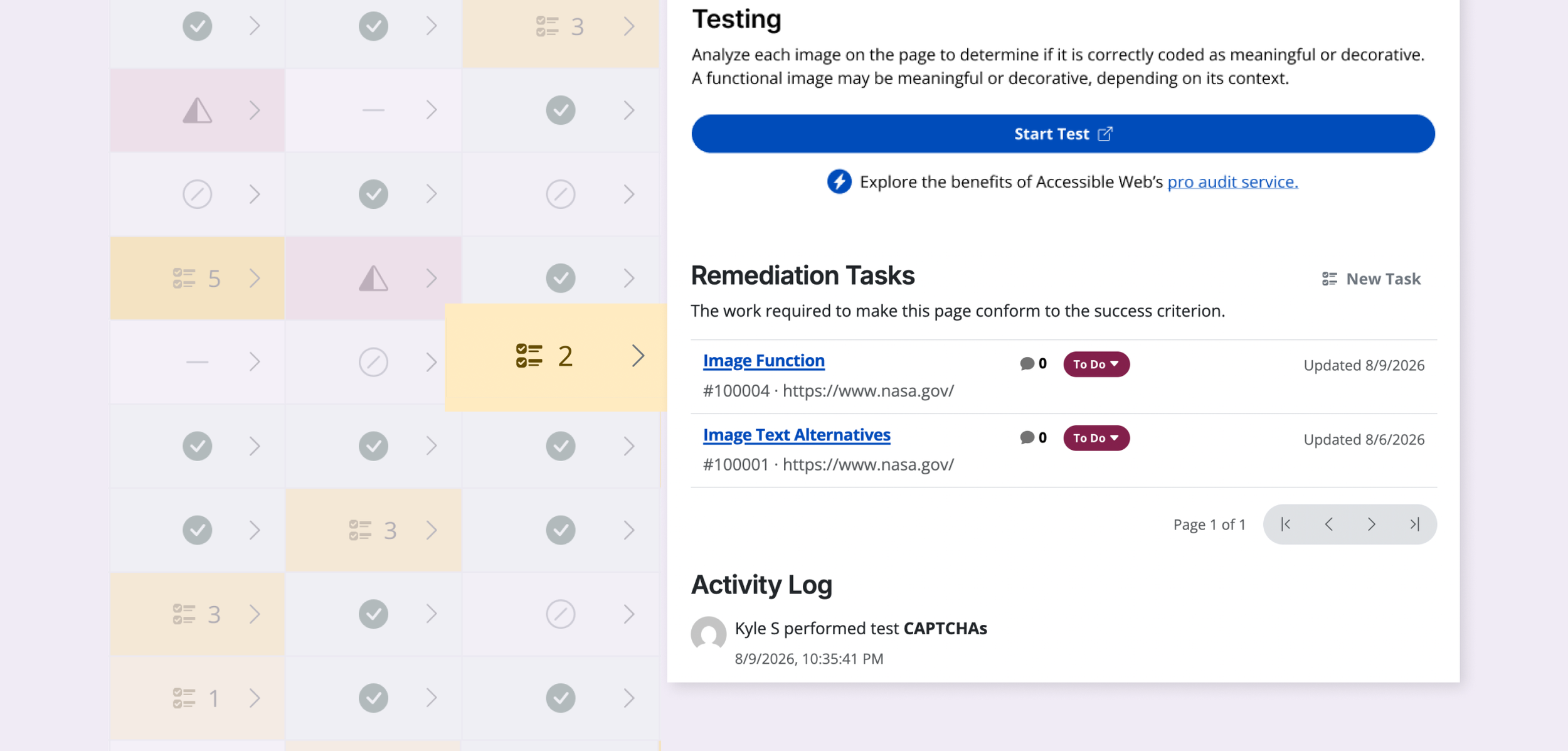
The heatmap gave users the high-level view, but they could still drill into any cell to understand what was behind it. Once testing began, the cell overview kept an activity log of completed tests and surfaced any remediation tasks associated with that criterion and page.
That gave users a persistent record of the work instead of reducing each cell to a status alone.
Streamlining the handoff
The old workflow required users to finish an audit, export the results, organize them in a workbook, and then create remediation tasks.
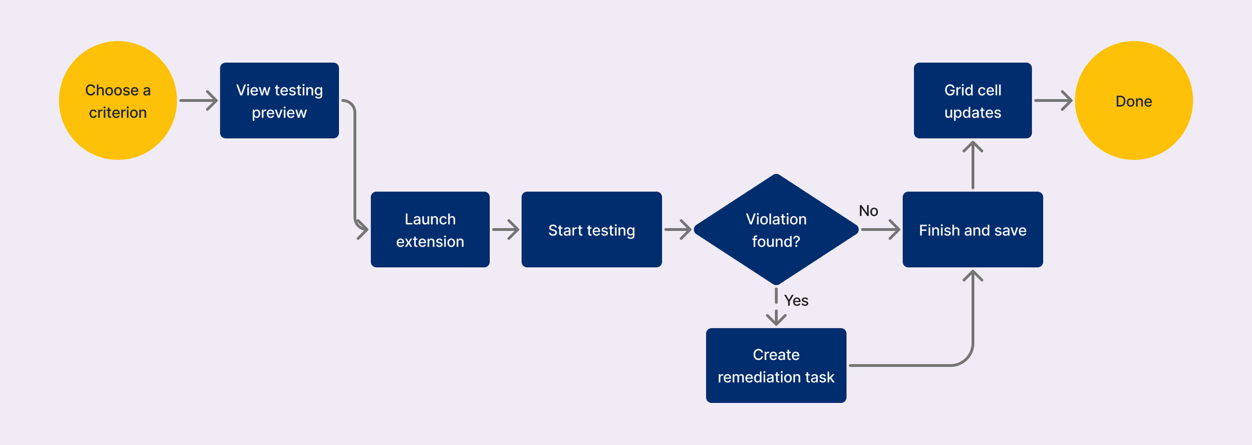
This solution brought those pieces closer together. Users still had to save each subtest as Completed or Not Applicable, a requirement of the existing backend, but once they did, that progress could feed directly back into the grid. If they found an issue, they could also create a remediation task from the extension instead of organizing their findings first.
We couldn’t remove every step, but we eliminated much of the work between testing and acting on the results.
Preserving the expert workflow within the new system
The redesign couldn’t come at the expense of the accessibility specialists already using RAMP to conduct professional audits.
Their existing workbook workflow remained available, giving power users the detailed tools they needed without forcing them into the new flexible flow.
Specialists could map their findings to specific page columns in the grid, so work completed through the professional audit process still surfaced in the same client-facing view.
Customers and specialists could work differently without creating two separate versions of the audit.
Bringing manual progress into the dashboard
The grid gave users a place to track the audit itself, but we also wanted manual testing to feel like part of the larger accessibility workflow in RAMP.
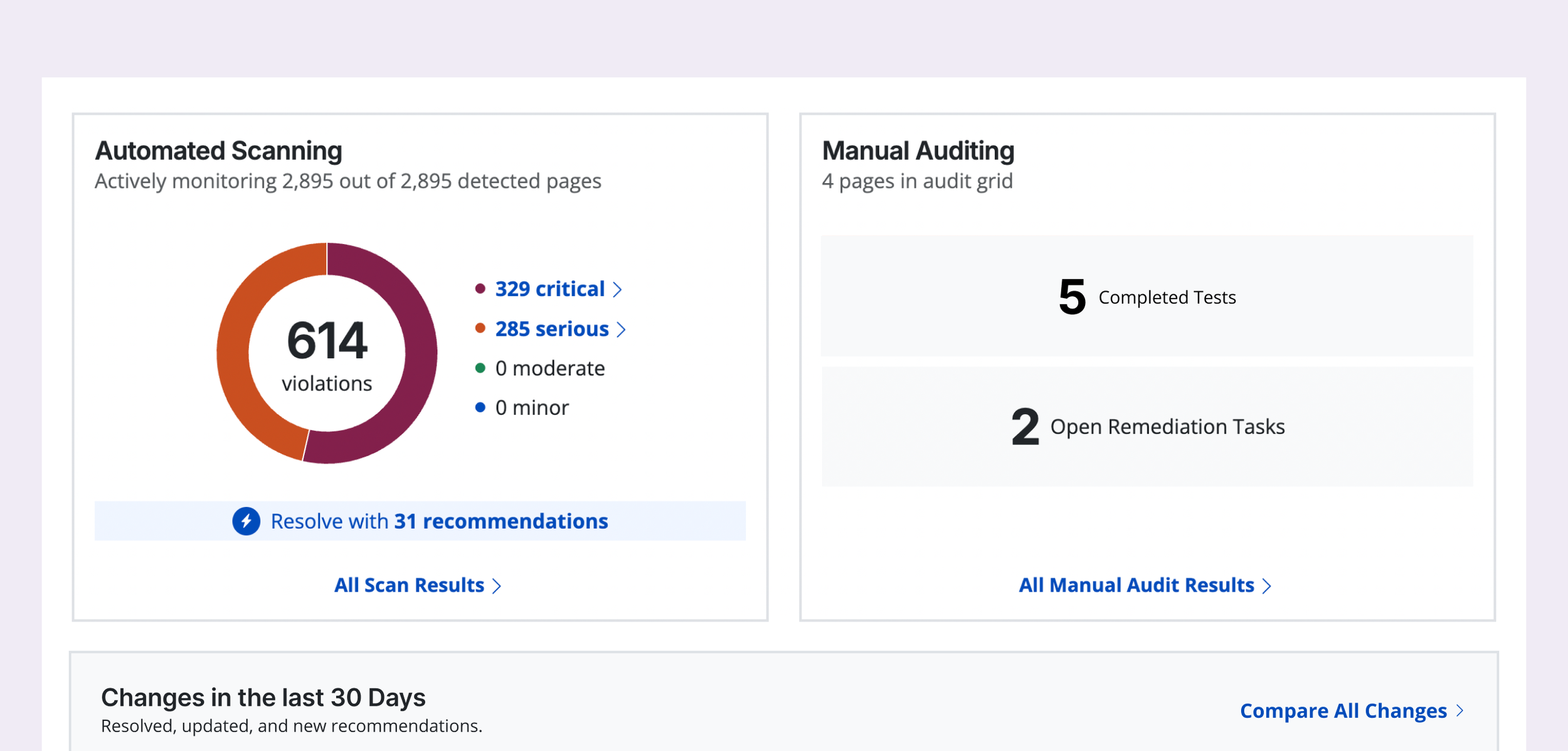
We added a manual auditing section to the Overview alongside automated scanning, showing completed tests and open remediation tasks. The first version was intentionally simple: we didn’t have enough time in the release to define a manual audit score that felt meaningful.
The goal was to give manual work a more visible place in the product and reinforce that a high automated score wasn’t the end of the accessibility process.
We’re continuing to explore a scoring model that can bring automated and manual progress together.
Impact
3.5x higher 1-month retention
Among users who completed the Audit Grid tour vs. RAMP’s overall average
+44% average DAU
In the quarter following launch, suggesting users had more reason to return
+26% average MRR
Average monthly recurring revenue increased in the quarter following launch.
Learnings and future refinements
With a two-month build, we prioritized restructuring the core audit experience and getting the grid into customers’ hands. A few areas were intentionally left for future iterations:
Smooth out testing in the extension.
Moving between individual tests requires back-and-forth that users have reported slows them down. Better navigation would make longer sessions faster and easier to move through.
Strengthen reporting and export.
We focused this release on conducting and tracking the audit. These results act as a skeleton for an eventual Accessibility Conformance Report, so exporting them into that template is the natural next step.
Unify automated and manual progress.
We didn’t want to introduce a manual-audit score without a defensible way to calculate it. I’d continue exploring a model that reflects both automated findings and human testing in the overall RAMP experience.